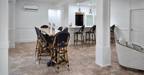
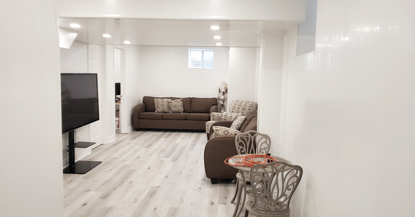
When it comes to selecting the perfect color for residential walls, one hue that stays popular year after year is light gray — it’s a versatile neutral shade that can enhance natural light and coordinate with any design style. And it’s one of the two colors that Trusscore Wall&CeilingBoard is available in. In this blog post, we explain why gray wall panels
like Trusscore Wall&CeilingBoard are a popular choice for homes, and how to accentuate the panels if you choose to install them.
Why Choose Gray for Your Home’s Walls?
If you’re planning a home renovation, you may want to upgrade your walls with a fresh coat of paint or new wall panels as part of the project. If white is too boring but you don’t want your walls to be too bold in terms of color, consider light gray paint or wall panels:
Gray is versatile and timeless
One of the most significant factors contributing to light gray's popularity is its versatility. Light gray can serve as canvas for a variety of design styles, from contemporary to traditional aesthetics. Its neutral nature allows it to complement an array of color palettes, making it a breeze to mix and match decor elements without clashing.
Gray has a serene and calming aura
Light gray has soft undertones that help to contribute to a sense of peacefulness and balance in a space. It’s perfect for areas where you plan to relax and unwind after a long day, like in bedrooms and living rooms.
Gray enhances natural light and space perception
Another reason why light gray is a favorite for residential walls is its unique ability to enhance natural light, creating an illusion of brightness and airiness. As a result, light gray can make a room feel more open and spacious, even in spaces with limited access to sunlight.
Gray is easy to coordinate with a wide range of décor elements
Choosing a wall color that doesn’t clash with your existing decor and furniture can be a daunting task. However, light gray can easily be coordinated with a wide range of decor elements and colors. From vibrant accent pieces to understated furniture, light gray acts as a unifying backdrop that allows your decor choices to shine. This opens up endless possibilities for personalizing and updating your living space as trends and tastes evolve.
Gray is neutral without being boring
One common misconception about neutral colors is that they can be bland or boring. However, light gray strikes the perfect balance between neutrality and visual interest. It adds depth to your walls without overpowering the decor or stealing attention from statement pieces. And its versatility allows you to play with different textures, patterns, and materials to create a space unique to you.
The Benefits of Gray Trusscore Wall&CeilingBoard Panels
Installing gray Trusscore Wall&CeilingBoard panels in your home is more than just a design choice. The pre-finished, high-performing panels have several benefits in addition to their glossy gray finish:
Strong and Durable
Trusscore Wall&CeilingBoard panels are scratch, dent, and damage resistant, keeping your walls free from scuffs and other marks.
Lightweight and Easy to Install
Trusscore Wall&CeilingBoard panels weigh 40% less than drywall and install four times faster with no mudding, taping, priming, or painting required.
Moisture and Water Resistant
Trusscore Wall&CeilingBoard panels are 100% moisture and water resistant, which means they’ll never grow mold or mildew in humid areas of your home like drywall.
Easy to Clean
Once your living space is outfitted in Trusscore Wall&CeilingBoard panels, it's easy maintain their beauty and longevity – you can keep your walls looking fresh and clean by regularly dusting and wiping down the panels with a soft, damp cloth to remove any dirt.
Design Versatility
Trusscore Wall&CeilingBoard can be installed vertically, horizontally, in a combination of white and gray, and can be integrated with Trusscore SlatWall to create an on-the-wall storage solution in rooms that need extra organization.
Start Planning Your Trusscore Project
Share your project dimensions and your preferred Trusscore products, and we'll whip up a detailed cost estimate and material list just for you.
Where Can You Install Gray Wall Panels in Your Home?
Trusscore Wall&CeilingBoard panels are best suited for high-traffic, humid, and utility areas like bathrooms, basements, laundry rooms, garages, and sheds, but they can be installed in other interior spaces, too. For example, in the living room, light gray Trusscore Wall&CeilingBoard panels can serve as an understated backdrop for your furniture. In the bedroom, the soft and soothing aura of light gray can help inspire rest and relaxation. In home offices and study areas, light gray panels foster focus and productivity, promoting a conducive atmosphere for work.
The neutral hue of light gray also makes it a perfect choice for kitchens, bathrooms, and dining areas, complementing a wide range of design styles.
How to Accentuate Gray Wall Panels in Your Living Space
Now that we've explored the attributes and applications of light gray wall panels like Trusscore Wall&CeilingBoard, here are five simple design ideas to accentuate gray walls in your residential living space:
Accentuate a Focal Point
Use light gray panels to create an accent wall that highlights a particular area or feature in a room, such as a fireplace, a window, or a gallery wall, and outfit the rest of the room in white Trusscore Wall&CeilingBoard.
Monochromatic Color Scheme
Embrace a monochromatic color scheme by pairing light gray panels with furnishings and decor elements in varying shades of gray and even black for a chic and cohesive look.
Natural Elements
Pair light gray panels with indoor plants, wooden furniture, and natural textures to bring a touch of the outdoors inside and create a calming oasis.
Modern Minimalism
Embrace clean lines and sleek, minimalist furniture to create a contemporary setting that lets the light gray panels take center stage.
Vintage Charm
Mix light gray panels with vintage-inspired furniture and decor to achieve a cozy and nostalgic ambiance.


